Sim xo
Tuesday, December 27, 2011
Happy New Year!
Hope you are all enjoying the holidays and gearing up for the New Year! Here's Here's wishing you a fantastic and brighter 2012!!
Sim xo
Sim xo
Sunday, December 18, 2011
Colour Me Happy...
...inspired by geometric shapes, bright colours and a dash of sparkle! And I will never tire of polka dots!
Sim xo
Sim xo
 |
| Colour Me Happy |
 |
| Work-in-progress |
Labels:
illustrations,
Portfolio
Tuesday, December 13, 2011
Season's Greetings!
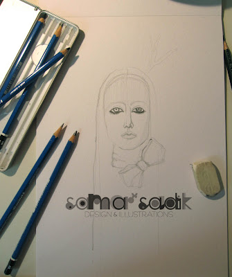
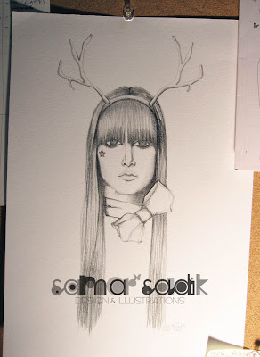
Here's my latest illustration for the season using pencil on paper and mixed media. Lately I have been inspired by images of animals and curious to mix them up with my drawings. And here's the first! So what do you think? Would love to get your thoughts as always so feel free to leave a comment or drop me a line : ) Oh and expect more soon!
Sim xo
Sim xo
 |
| The beginning... |
 |
| ..and the finished illustration! |
Labels:
illustrations,
Portfolio
Thursday, December 8, 2011
Da Sheepster
Happy December everyone! I was asked to create my version of Da Sheepster purely for fun and since 'tis the season I thought of injecting a dose of Xmas in him ; ) He's hilarious! For a good laugh check him out on Facebook http://www.facebook.com/dasheepster
 |
| http://dasheepster.com/ |
Labels:
illustrations
Saturday, August 20, 2011
Birthday Buff
I decided to gift my brother a funny illustration of himself, looking all buffed up and ripped taking inspiration from Wolverine. But perhaps the other scene is closer to reality : ) Happy Birthday Fadzzz!!
Saturday, August 6, 2011
Type Player 2
If you're in search for some typography inspiration and ideas, Type Player 2 is worth buying. The book takes a new perspective on some brilliant ideas of typography design in different areas, ranging from illustration to hand-crafted sculptured forms using unexpected materials such as barbed wire, yarn and grass to name a few, and it's application in different environments. The book presents a fantastic collection of both commissioned and self-initiated projects that clearly display a modern take on the use of typography.
Labels:
books,
Inspiration
Monday, August 1, 2011
Paris Pulse
I recently designed this colorful banner for www.parispulse.com . The design is an all-encompassing portrait of Paris's unique and vibrant culture.
Paris Pulse is an honest restaurant review website that uses an easy 1-5 star rating system that tells you everything you need to know about the place from it's ambiance and decor to the quality and taste of the food. So if you're on your way to Paris or living there make sure you bookmark Paris Pulse!

Labels:
illustrations
Friday, July 29, 2011
Sunday, June 19, 2011
Book Art - Literally!
I couldn't believe it when I saw this brilliant work of art by Isaac Salazar. Each page is meticulously folded to create an amazing series of typography artwork. Wow!
Labels:
Inspiration
Wednesday, June 1, 2011
Wednesday Windows: Polaroids
The other day I noticed the new displays for Banana Republic and I wasn't too impressed. While the concept is interesting, the execution was, well, very bland in my opinion- sorry BR Dubai! But they reminded me of a window display pitch I worked on a couple of months ago which was based on a similar theme using polaroid pictures. The idea was to recreate a nostalgic feel of a summer beach holiday using vintage style images mixed with a few nautical elements. It's not final and I'm not sure what it would've ended up like but I'd really like a beach vacation right now....
 |
| Nautical Nostalgia design concept |
 |
| BR Dubai...sorry but kind of bland! |
 |
| Close-up of the polaroids |
 |
| An article from Elle Decoration UK June 2011 featuring a creative pop-up style window display for BR on Regent Street, London. |
Monday, May 30, 2011
Monday Moodboard: Pretty Pastels
- Keep Calm and Carry On poster. Good reminder especially for the self-employed! http://www.keepcalmandcarryon.com
- Missoni Mare Bristol zigzag crochet-knit swimsuit.
http://www.net-a-porter.com/ - Art deco fashion illustration by Erte
- Forest Views- wallpaper collection in cooperation with photowall
from Studio Rita - 'Journey' by Simply Hue Designs
- Ditte Sofa, Fred Shand Pink from Anthropologie
- The Sim mobile : )
- Dot The I's Events. Events planning and services. http://www.dtievents.com
Logo design by Samar Sadik Design & Illustrations - Hussein Chalayan, Vogue, December 2008
Sunday, May 29, 2011
Eco Living Illustrations
Here's another illustrated feature I did for Emirates Home magazine. A good article full of green living tips and ideas for those who want to adopt an eco-friendly lifestyle. Hope this comes in handy!

Labels:
illustrations,
New work
Tuesday, May 24, 2011
Windows On Wednesdays
And here's another new category for my blog! I have always noticed window display designs before looking at the name of the store. I pay particular attention to the art, illustrations, typographic treatments involved and overall composition of the elements. Some use modern technology such as big massive screens showing for example a video of the collection and others integrate interactive technology to engage passersby eventually enticing them to come in and shop.
To me, a window display is like a window to another world. As a designer, it's an opportunity to create a fantasy world with some drama perhaps. My all-time favorite are those by Liberty of London. They are by far the most creative, artistic, very inspiring and fall perfectly in line with the Liberty brand. I hope they plan to come to Dubai. I would gladly design their displays (big smiley)!
To me, a window display is like a window to another world. As a designer, it's an opportunity to create a fantasy world with some drama perhaps. My all-time favorite are those by Liberty of London. They are by far the most creative, artistic, very inspiring and fall perfectly in line with the Liberty brand. I hope they plan to come to Dubai. I would gladly design their displays (big smiley)!
 |
| Love the mural for Symphony at the Dubai Mall. By Moaza Matar |
 |
| Another lovely mural for Symphony at the Dubai Mall by Moaza Matar |
 |
| Symphony at the Dubai Mall by Moaza Mata |
 |
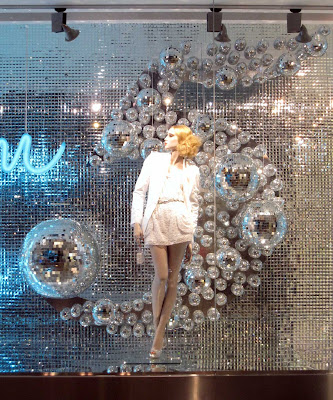
| Harvey Niks goes bling bling using a disco ball theme |
 |
| Add caption |
 |
| Good use of typography |
 |
| Add caption |
 |
| This Bloomies window at the Dubai Mall reminds me of Avatar |
 |
| Strong vibrant colours are in line with the s/s 2011 collections |
 |
| Interesting typographic treatment |
 |
| The posters have a vintage feel to them and are in line with the 1969 campaign |
 |
| Cool idea using a screen to showcase the Desigual collection to passersby |
 |
| Sensory overload is part of the Desigual brand |
 |
| Another example of blown-up typography |
Subscribe to:
Posts (Atom)


